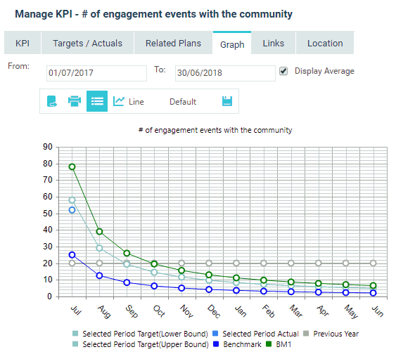
To view a graphical representation of a KPI, click the 'Graph' tab.
It displays target and actual information for reported and previous periods (plus benchmark information if it has been activated for the KPI). You can also select the period by defining the dates within From and To selections.
You can toggle among cumulative, average and normal aggregation methods by using the ‘DISPLAY CUMULATIVE’/ 'DISPLAY AVERAGE' / ‘DISPLAY NORMAL’ tick box. The tick box name would be changed based on the type of aggregation defined against the KPI. As per the following example, ticking 'DISPLAY AVERAGE' will provide you averaged figures across the selected date range, however, unticking the same tick box would provide corresponding period figures.
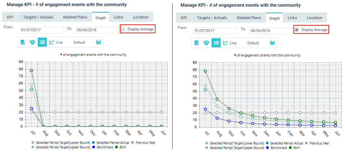
NOTE: the 'From', 'To' and ‘DISPLAY CUMULATIVE’/ 'DISPLAY AVERAGE' / ‘DISPLAY NORMAL’ functions will not update original KPI details. The purpose of these options is to be able to analyse the graphical trends under each option, but not updating the KPI's original definition under KPI definition page. The changes to the graph options can only be changed and saved as default, so next time you come in, defaulted state would be displayed.
If the KPI is always meant to show cumulative for example, you can change your KPI Aggregation to be ‘Cumulative’ and then the ‘Display Cumulative’ tick box will always be ticked for the graph view. However this will also show cumulative targets and actuals in respective areas as per the standard business rules.
Also, you can select the chart type (Static or Interactive) using the My Settings page.
Static - The KPI graph used in previous versions.
Interactive - KPI graph with Interactivity, newly introduced.
If you are using the static view, you have following options are available to change the chart display:
|
Function |
Description |
|
Show/Hide Legend |
Toggles the legend on or off |
|
Chart Type dropdown list |
Choose from a number of different charts to view the data from (Line/Column/Bar/Area etc.) |
|
Colour Scheme dropdown list |
Select a colour scheme for the chart |
A summary of the interactive chart options are given below:
|
Function |
Description |
|
Export as Image |
Open or Save the chart as a .png file |
|
Print the chart |
|
|
Legend |
Toggles the legend on or off |
|
Chart Type dropdown list |
Choose from a number of different charts to view the data from |
|
Colour Scheme dropdown list |
Select a colour scheme for the chart |
Copyright © 2014-2015 CAMMS Online Help. All rights reserved.
Last revised: September 04, 2018